Get a Quick Overview of Your Energy Use
In addition to showing your current use patterns, the energy charts available in My Energy Center also offer some quick analysis features: historical comparisons and temperature lines. As you start seeing trends, you can start finding ways to save energy.
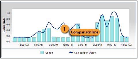
Historical Comparisons
Making comparisons between your current and past electricity use can help to understand trends and find ways to save energy.
Select one of the options under Compare, located under the graph:
- Comparison information displays as a navy-blue trend line.
- If your trend line has gaps, it’s because there is missing historical data.
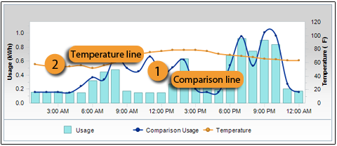
Temperature Lines
Viewing temperature information can help you analyze how weather affects your use of electricity.
To view how temperature impacts your current electricity use, select Show Temperature under Display.
- The temperature option shows up as an orange trend line.
-
If your trend line has gaps, it is because there is missing temperature data.
Historical and Temperature Comparisons - Day View
In the day view, you can also select Show Temperature under Compare for more detailed analysis.
This second temperature line will show up as a pink trend line.